Tuesday, September 12, 2006

Working on Interactiondesign Blog

At the moment I am a bit busy setting up a blog for interaction designers (mainly located in Austria). That's why I do not really find time to write my next review. I'm sorry for that, but please be patient, I promise to do my best to come back :)

Until it is so far - are there any suggestions for the next review? As mentioned, I wanted to take a closer look to Blinklist (because they asked). Another interesting stuff would be Vox from the people of Sixapart.

cu, thx, Erhard

Saturday, August 12, 2006

zooomr.com

Yes. I always wanted to write a review about zooomr.com, because from the first day on I think that photos combined with their geographical location (using google map) is a killer combination. The funny thing is that for my opinion there is no real application (until now) which uses the full potential of these opportunities.

Most of the pictures I see, are just snapshots from anywhere in the world, which do not give me any special benefit and I wonder why e.g. the tourism industry has not yet jumped on that train. Wouldn't it be nice to be introduced on special holiday goals including photos and location of the hotel, the nicest bars, sightseeing points, beaches and so on?

(One exception - I heard from that guy who provided pictures from real-estate combined with the location of the houses. This for example is a real benefit for his customers I think)

I (as mountainbiker) always dream of mountainbike tracks, which show me the track on a map, combined with photos and videos from all the different places of the track (the more the better). I would love that and hopefully some day I can realize this kind of project ;)

Of course it can be that I just didn't find out that these kind of applications already exist, so if you have any hints, please write me :)

  1. First Impression ....
  2. Look and Feel .........
  3. Usability .................
  4. Features...................
  5. Benefit ....................
  1. First Impression

    The zooomr layout became clearer since the last redesign for my opinion.
    I can clearly realize the areas of navigation, search, and so on. Furthermore the mainpart - geotagging photos - is displayed on the front page.


    Only the sign up process confused me a bit. I'm not sure if I ever understood what was going on there with the myopenid functionality.

    And there's my first suggestion: The point where the photo has been taken is much too detailed for my opinion.

    "Where am I?" I would strongly recommend an overview of e.g. the land or the continent, because the name of a street in a town I can't identify does not give me the information I want or even expect.


    I miss the slider (2) in the small map and I think it would be nice to get the opportunity to zoom in to the maximum (1) the map can display, so that I don't get these "Sorry, the map cannot be displayed..." text which appears a bit too often for my opinion.

    The overview (3) link could bring me back to a (system-defined) zoom scale. Ok, I know this is hard from a programmatic point of view, but here it's only a suggestion.


    One could also add a detailed view (5) using a simple mouseover (4) on the image.


  2. Look and Feel

    • Colors
      I like the different colors of the navigation bar, though it can easily be a little bit confusing. Because the eye has to adjust very fast on the different background color.

    • Fonts
      The Fonts are ok, I think. Maybe a bit small and the grey on top for "Hello ..." and "Sign-Out" is a bit too dark.

    • Icons
      I think the icons could be designed a bit more professional. The graphic-design has not really a consistent look and the meaning of the icons sometimes is time not really clear.


      It is very difficult to explain things like "Get nearby photos for this photo" and so on with icons. I would try to solve it either with a context menu or with a separate menu (click on the photo > select the menu entry). I know this needs one mouseclick more, but let's take a look here ...


      Proposal for a contenxt menu solution


      Proposal for a toolbar menu solution

  3. Usability

    • Navigation
      The different colors zooomr.com uses for their tabs are quite nice. There's only one thing which disturbs me, WelcomeMat and Upload are designed as tabs, though they are links


      I would just display WelcomeMat and Upload as simple links.


    • Start GeoTagging
      To be honest, it took me quite a time until I realized that I just have to click (shortly) into the map. I expected some kind of ... context menu or special kind of cursor, pointer or something.

      zooomr.com uses the hand-symbol as cursor for defining the point in the map and that was confusing for me. The other thing is that at first I always clicked long into the map - and nothing happend. (That's a bug for my opinion.)


      I would provide the cross-cursor or any special kind of cursor so that the user knows, "Ok, now the system is ready for defining a point"'


      That's nice. When you move the mouse over a selected photo it gets a red border, when you move it over a photo in the left column it gets a green border. I like this metapher for ADD and REMOVE. (Though it is a problem for people with red-green color blindness.)

      Start Over is a bit unclear to me.


      Ok, here we are.

      Tabs:

      • MiniMap: I'm not really sure what the benefit here is
      • ADD (+): Uuups. A button disguised as tab. (usability bug ;)

  4. Features

    Ok, most of the features I already discussed before, but some small things are still left.

    • Discover > GeoTagged
      One of the icons in the photo provides the function "Get nearby photos for this photo". But at that moment I don't know the location of the current photo, so what is "nearby"?

    • The World > Tag Map
      When I type in e.g. Mountainbike I get the following result below. Again, I don't know, where I am and why can't I type in e.g. Mountainbike, Austria?


      The main problem at the whole application for my opinion is that the geo-reference is not combined with the users location.

      So normally I am mostly interested in photos of Austria, so it would be nice if the system could set Austria as my main destination (and not North America). And for all those who do not like that - one could make it customizeable ;)

    • Upload
      I like the design and the information I get here, but what I miss is the possiblity for multi-upload and a progress bar.


  5. Benefit
    As mentioned on top of my entry the possiblities of zooomr.com have the potential of a killer application for me. I am really looking forward to see upcoming ideas which use more of this possibilities.
Thank you,
Erhard Wimmer

Monday, August 07, 2006

coming soon ... zooomr and blinklist

I'm currently working on two reviews for zooomr.com and blinklist.com.
Hopefully the zooomr review will be online at the end of the week.
Thanks for your patience :)

Note: I had the possiblity to participate a meeting at the knallgrau office, where the home of blogr.com is. We spoke about the design and some usability things i mentioned in my last review. Was very interesting and quite nice. Thanks to Matthias.

Friday, July 07, 2006

blogr.com

Well, another blog-foto-.. site and this time it's from an Austrian crew again, called Knallgrau! This is enough reason to take a closer look and discuss the interface and 'look and feel' of this application.

What I like is this new kind of style with the big letters and big input fields as e.g. Dropsend or Photojojo also use it. What I also appreciate is a kind of new communication with the users which increases usability a lot, as I think. Further details can be read under thinkvitamin (can't find the entry at the moment...)
  1. First Impression

    As I mentioned before the first impression is really nice, the registration works uncomplicated and looks very clear. The second step (into the app) becomes a little bit more complicated on the first look. So I need some time to orientate myself, and I think the colors for the default-template are one reason for that.

  2. Look and Feel
    What I find a little bit disturbing is this kind of separation blogr.com uses for its main areas Photo, Video, Blog in this strange-looking "L" form ;)


    The colors and fonts could sometimes use a little bit more contrast, especially the grey fonts are sometimes not so easy to read. All in all the design of blogr.com is not as fancy as most of the other web 2.0 apps, but has it's advantages.

  3. Usability
    The concept of View and Edit is not completely satisfying designed for my opinion. At first I was looking for an opportunity to add videos and photos in the "View" section besides Photo and Video (as I am used that from flickr.com and zooomr.com) after I realised that I've to change to Edit Mode using the menu in the second line.

    The problem is that blogr.com uses the concept of blogs (edit & view, as e.g. blogger.com does that, too) also for the videos and photos area. But here I expect the same behavior as used at flickr.com or zooomr.com and this means a direct upload opportunity at the photos itself.

    And the other problem is, that I often don't know in which mode I'm currently in. The only orientation I see is the orange Visit Space button. As I mentioned before, the wording Manage this Space / Visit Space could maybe be improved ;)

    The Edit Mode itself has wonderful opportunities, but also some kind of unsolved problems as I think:

    blogr.com uses different navigation opportunities in the Manage section:

    • A combination of the menu on the left side and the tabs, when you are in the Manage mode.

    • And the shortcuts (Manage.., Upload, ..) in the second line, which lead you directly into several areas of the manage mode.

    The main usability-problem is that the tabs are also affected by the navigation on the left and several function buttons in other tabs. That's really confusing and a big usability bug for my opinion ;)

    For example, Upload is a menu point and a tab. When you open the Upload tab, the complete menu point (and not the tab) changes. (and so on...)


    Create New Posting is a button and a tab, so when you click on the button the tab changes, which is also not ideal


  4. Features

    • Edit Photo: amazing feature where one can edit the surface of the photos - in a web app.

    • Upload: Missing progress bar and Save functionality. What happens, when I forget to save after uploading an e.g. 30MB video file?

    • Picture Size: I love that, you can define your picture size just by using this slider. Great.

    • Delete: brings me to the manage area after I deleted a photo. But do I want that? Suddenly I am in the menupoint Mediastream?! The rollover behavior in this area is also a bit 'unusually'.

    • Create a photoalbum: A great solution for my opinion. One click adds a photo, click on the [x] icon of a photo removes it. That's the way it should be :) No dialog window, no checkboxes.

  5. Benefit

  6. The combination of videos, photos and blog is a logical next step in the web 2.0 scene and it's great how knallgrau did that job for most parts of this app. As mentioned before it's really easy to registrate and get your own URL.

Thursday, June 22, 2006

ohdontforget.com

or the maximum of minimalism
http://ohdontforget.com

I found that nice tool on http://www.thinkvitamin.com and started to try it out. It looks quite easy, but then.. I fail on the cell-number :(


The Look and Feel of the web-app looks simple and clear, but for my opinion ohdontforget.com made it a little bit too simple and clear ;)

On the first look it's interesting, that the whole description of the application is written under each input field. That has a kind of new feeling to me. A Webapp with (almost) one side :)
But what, if that is not enough for me? In my case: Which kind of numbers are supported?


Besides a more significant error message, I miss a How to.. or Help function.
It could have been easy, if
  • they've told me which number is being supported
  • and if they wouldn't have deleted my input fields (aargh)
All in all the approach looks cool, but for my opinion the design process is not yet completely finished.

Tuesday, April 25, 2006

Google Calendar

Well, it was just a question of time ;) ...
http://calendar.google.com

I think one needs a Gmail account but there's also the tour:
http://www.google.com/googlecalendar/tour.html

  1. First Impression / Look and Feel

    The first impression reminds one on Apple's iCal. Not only the color but also the Manage Calendars feature which I would like to introduce later a bit more. All in all it's very easy and it makes fun to add new appointments, move, enlarge and edit them.

    The feel of webapplications using Ajax is great, because they don't feel like webapplications anymore ;)

  2. Usability

    As mentioned before I really appreciate the feel of this application. Google's calendar team really found easy solution for example to create new events..

    • C r e a t e E v e n t

      Really simple, just click on a day, type in the event and confirm. That's what it should be. No dialog, no complex input fields. If you want to describe the event more detailed, you can also do this now using the link or later, opening the event again.


    • Q u i c k A d d

      That's great, I love this feature. Try it out it really works.

      It also works, if you type in the date, e.g. "30.4. 10pm"

    • S h a r e C a l e n d a r s

      The share - respective the search - functionality is one of the core points for me. So you can find every calendar which is shared in the web. That makes collaborative work a lot easier for people who don't (want) to use e.g. a Microsoft Exchange Server or something like this.

      And it's funny to search for e.g. "Google" or "Apple" to see who has this kinds of event in his calendar.

    • M a n a g e r C a l e n d a r s

      The reason why I select this feature for a "redesign" is that I found it quite unclear using it the first three, four times. So I think it's worth for a closer look.


      My Calendars vs. Other Calendars
      -----------------------------
      When I open Google's calendar for the first time I do not know the difference between "My Calendars" and "Other Calendars". And to be honest I'm still not sure if one really needs such a strong separation here.

      Maybe 10 px of whitespace would be enough, because normally I know my own calendars Maybe the word "Other" was selected a bit unhappily.

      Add new calendar
      -----------------------------
      Normally I associate the "+" symbol with 'Adding a new row'. I did not expect a dialog here. So I would replace the plus-symbols with a simple "Add" function.

      a) My first screenshot provides a small toolbar with one Add function. So I would just add this tab to the Add Other Calendars tabs.


      b) The second suggestion simply replaces the "+" symbol with the word "Add" and places it on the right side.


      Search
      -----------------------------
      The search field under "Other Calendars" seems to be pracitcal on the first sight, but makes the whole feature a bit toocomplicated. It's good to find the search field where you act with your calendars, but ... when I use Google I expect o n e search field on top of the site. So I would add another button called "Search public calendars".

      Manage Calendars
      -----------------------------
      I'm not sure why "Manage Calendars" is a link. It feels a little bit strange and I find it does not really look good. So I add another toolbar function called "Manage".

Monday, January 30, 2006

Babyname Wizard

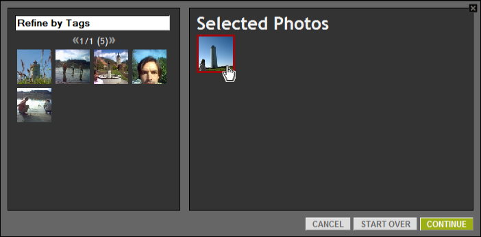
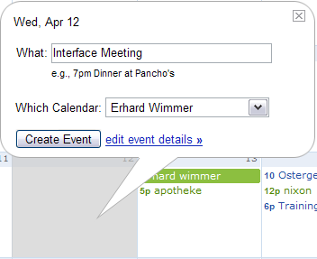
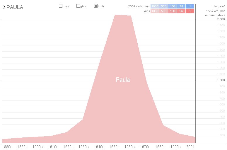
Please let me introduce you a little java tool that symbolizes for me what infographic can be: 
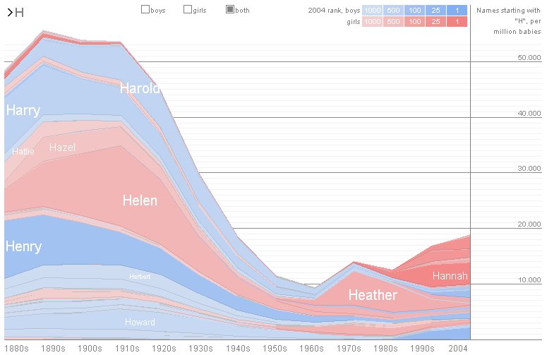
babynamewizard.com is an example how 'boring' statistics can be transformed into an exciting, funny and also informative experience.


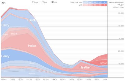
It's really easy to get the point and to use and 'understand' this tool. Of course, names are not really boring, but the fascinating point for me here is the composition of the following three things, which symbolize for me the success of babynamewizard.com

  • color coding (boys vs. girls :)
  • lightly animation and
  • hard facts (statistics)

The color coding of course is nice but it is also informative, because you can separate on the first look between boys and girls. The color coding also is selected very fine, it reached very exactly this 'baby-feeling' :)


And especially the lightly animation brings some aspects of 'Spannung' (excitement) to the user ("How far will it grow?"). We can also find this kind of animation at TV presentations of election results, where the 'Balken' of each party grow from the ground to the finally reached end result. And this is really exciting for me each time :)

Though the whole tool is really simple, I also found some disadvantages on the usability side.
  • no back button

    Instead of the back button you can use the DEL button on your keyboard, but for my opinion this is not enough. What if you first type in 'Esmeralda', then you type in 'Emanuela' and then you wanna go back to 'Esmeralda'? It's not possible, and that's a pitty.
  • no support of the browser back button

    Beneath the missing back button the site also does not support the browser back button. Why? The whole site is contained in a Java Application, so if you type in 'Emanuela' (concerning to the former example) and wanna go back to 'Esmeralda', what you then get is the former visited page(!) - Google for example. So that's really terrible, and every time you are going back to babynamewizard.com again the site has to load the Java App again. Of course it is in the cache already, but the system everytime starts loading the Java App again and again. :(

    The really terrible point for me here's that people are usedto use the browser back button and the system 'bestraft' ('hurts') them every time they do what they are used to do. (Bad developer ;) So I do not get around that this strongly reminds me on Stop Smoking attempts in the seventies, where you got 'electronic shocks' every time you grap for a cigarette :D

  • no zoom functionality

    If you type in e.g. "Ja", the result is a huge amount of names, which cannot all be displayed. So you have to reach every entry with your mouse, which of course is not always possible. I could not detect any zoom functionality but I am wishing one.