Google Calendar
Well, it was just a question of time ;) ...
http://calendar.google.com
I think one needs a Gmail account but there's also the tour:
http://www.google.com/googlecalendar/tour.html
- First Impression / Look and Feel
The first impression reminds one on Apple's iCal. Not only the color but also the Manage Calendars feature which I would like to introduce later a bit more. All in all it's very easy and it makes fun to add new appointments, move, enlarge and edit them.
The feel of webapplications using Ajax is great, because they don't feel like webapplications anymore ;) - Usability
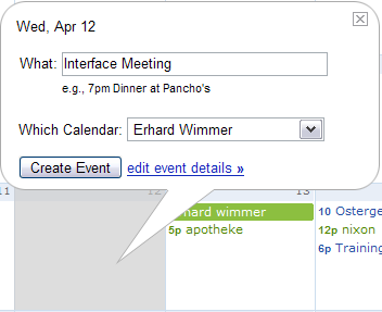
As mentioned before I really appreciate the feel of this application. Google's calendar team really found easy solution for example to create new events.. - C r e a t e E v e n t
Really simple, just click on a day, type in the event and confirm. That's what it should be. No dialog, no complex input fields. If you want to describe the event more detailed, you can also do this now using the link or later, opening the event again.
- Q u i c k A d d
That's great, I love this feature. Try it out it really works.
It also works, if you type in the date, e.g. "30.4. 10pm" - S h a r e C a l e n d a r s
The share - respective the search - functionality is one of the core points for me. So you can find every calendar which is shared in the web. That makes collaborative work a lot easier for people who don't (want) to use e.g. a Microsoft Exchange Server or something like this.
And it's funny to search for e.g. "Google" or "Apple" to see who has this kinds of event in his calendar. - M a n a g e r C a l e n d a r s
The reason why I select this feature for a "redesign" is that I found it quite unclear using it the first three, four times. So I think it's worth for a closer look.
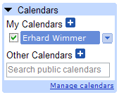
My Calendars vs. Other Calendars
-----------------------------
When I open Google's calendar for the first time I do not know the difference between "My Calendars" and "Other Calendars". And to be honest I'm still not sure if one really needs such a strong separation here.
Maybe 10 px of whitespace would be enough, because normally I know my own calendars Maybe the word "Other" was selected a bit unhappily.
Add new calendar
-----------------------------
Normally I associate the "+" symbol with 'Adding a new row'. I did not expect a dialog here. So I would replace the plus-symbols with a simple "Add" function.
a) My first screenshot provides a small toolbar with one Add function. So I would just add this tab to the Add Other Calendars tabs.
b) The second suggestion simply replaces the "+" symbol with the word "Add" and places it on the right side.
Search
-----------------------------
The search field under "Other Calendars" seems to be pracitcal on the first sight, but makes the whole feature a bit toocomplicated. It's good to find the search field where you act with your calendars, but ... when I use Google I expect o n e search field on top of the site. So I would add another button called "Search public calendars".
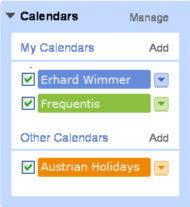
Manage Calendars
-----------------------------
I'm not sure why "Manage Calendars" is a link. It feels a little bit strange and I find it does not really look good. So I add another toolbar function called "Manage".


posted by Erhard @ 8:40 AM
0 comments
![]()