zooomr.com
Yes. I always wanted to write a review about zooomr.com, because from the first day on I think that photos combined with their geographical location (using google map) is a killer combination. The funny thing is that for my opinion there is no real application (until now) which uses the full potential of these opportunities.
Most of the pictures I see, are just snapshots from anywhere in the world, which do not give me any special benefit and I wonder why e.g. the tourism industry has not yet jumped on that train. Wouldn't it be nice to be introduced on special holiday goals including photos and location of the hotel, the nicest bars, sightseeing points, beaches and so on?
(One exception - I heard from that guy who provided pictures from real-estate combined with the location of the houses. This for example is a real benefit for his customers I think)
I (as mountainbiker) always dream of mountainbike tracks, which show me the track on a map, combined with photos and videos from all the different places of the track (the more the better). I would love that and hopefully some day I can realize this kind of project ;)
Of course it can be that I just didn't find out that these kind of applications already exist, so if you have any hints, please write me :)
- First Impression ....

- Look and Feel .........
- Usability .................

- Features...................
- Benefit ....................


- First Impression
The zooomr layout became clearer since the last redesign for my opinion.
I can clearly realize the areas of navigation, search, and so on. Furthermore the mainpart - geotagging photos - is displayed on the front page.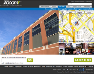
Only the sign up process confused me a bit. I'm not sure if I ever understood what was going on there with the myopenid functionality.
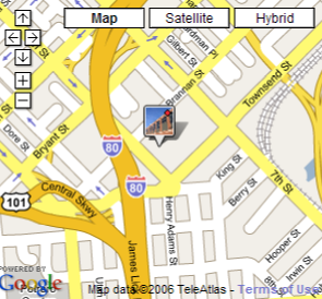
And there's my first suggestion: The point where the photo has been taken is much too detailed for my opinion.
"Where am I?" I would strongly recommend an overview of e.g. the land or the continent, because the name of a street in a town I can't identify does not give me the information I want or even expect.
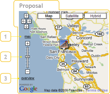
The overview (3) link could bring me back to a (system-defined) zoom scale. Ok, I know this is hard from a programmatic point of view, but here it's only a suggestion.
I miss the slider (2) in the small map and I think it would be nice to get the opportunity to zoom in to the maximum (1) the map can display, so that I don't get these "Sorry, the map cannot be displayed..." text which appears a bit too often for my opinion.
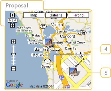
One could also add a detailed view (5) using a simple mouseover (4) on the image. - Look and Feel
- Colors
I like the different colors of the navigation bar, though it can easily be a little bit confusing. Because the eye has to adjust very fast on the different background color. - Fonts
The Fonts are ok, I think. Maybe a bit small and the grey on top for "Hello ..." and "Sign-Out" is a bit too dark. - Icons
I think the icons could be designed a bit more professional. The graphic-design has not really a consistent look and the meaning of the icons sometimes is time not really clear.
It is very difficult to explain things like "Get nearby photos for this photo" and so on with icons. I would try to solve it either with a context menu or with a separate menu (click on the photo > select the menu entry). I know this needs one mouseclick more, but let's take a look here ...
Proposal for a contenxt menu solution
Proposal for a toolbar menu solution - Usability
- Navigation
The different colors zooomr.com uses for their tabs are quite nice. There's only one thing which disturbs me, WelcomeMat and Upload are designed as tabs, though they are links
I would just display WelcomeMat and Upload as simple links.
- Start GeoTagging
To be honest, it took me quite a time until I realized that I just have to click (shortly) into the map. I expected some kind of ... context menu or special kind of cursor, pointer or something.
zooomr.com uses the hand-symbol as cursor for defining the point in the map and that was confusing for me. The other thing is that at first I always clicked long into the map - and nothing happend. (That's a bug for my opinion.)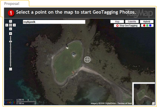
I would provide the cross-cursor or any special kind of cursor so that the user knows, "Ok, now the system is ready for defining a point"'
Tabs: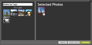
That's nice. When you move the mouse over a selected photo it gets a red border, when you move it over a photo in the left column it gets a green border. I like this metapher for ADD and REMOVE. (Though it is a problem for people with red-green color blindness.)
Start Over is a bit unclear to me.
Ok, here we are.- MiniMap: I'm not really sure what the benefit here is
- ADD (+): Uuups. A button disguised as tab. (usability bug ;)
- Features
Ok, most of the features I already discussed before, but some small things are still left. - Discover > GeoTagged
One of the icons in the photo provides the function "Get nearby photos for this photo". But at that moment I don't know the location of the current photo, so what is "nearby"? - The World > Tag Map
When I type in e.g. Mountainbike I get the following result below. Again, I don't know, where I am and why can't I type in e.g. Mountainbike, Austria?
The main problem at the whole application for my opinion is that the geo-reference is not combined with the users location.So normally I am mostly interested in photos of Austria, so it would be nice if the system could set Austria as my main destination (and not North America). And for all those who do not like that - one could make it customizeable ;)
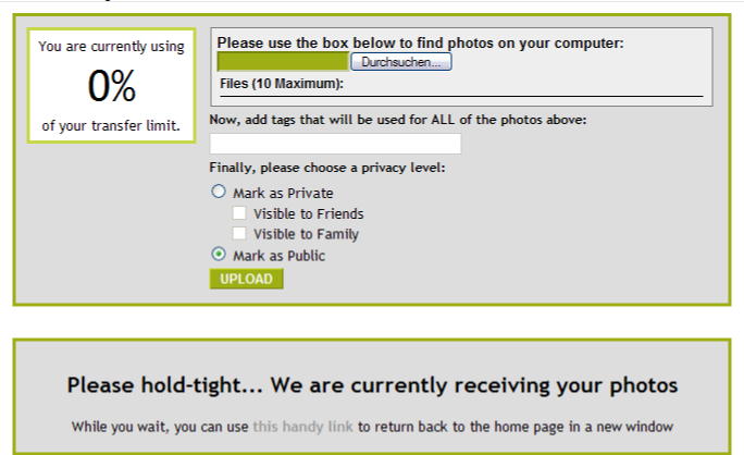
- Upload
I like the design and the information I get here, but what I miss is the possiblity for multi-upload and a progress bar.
- Benefit
As mentioned on top of my entry the possiblities of zooomr.com have the potential of a killer application for me. I am really looking forward to see upcoming ideas which use more of this possibilities.


Erhard Wimmer
posted by Erhard @ 6:55 AM
1 comments
![]()